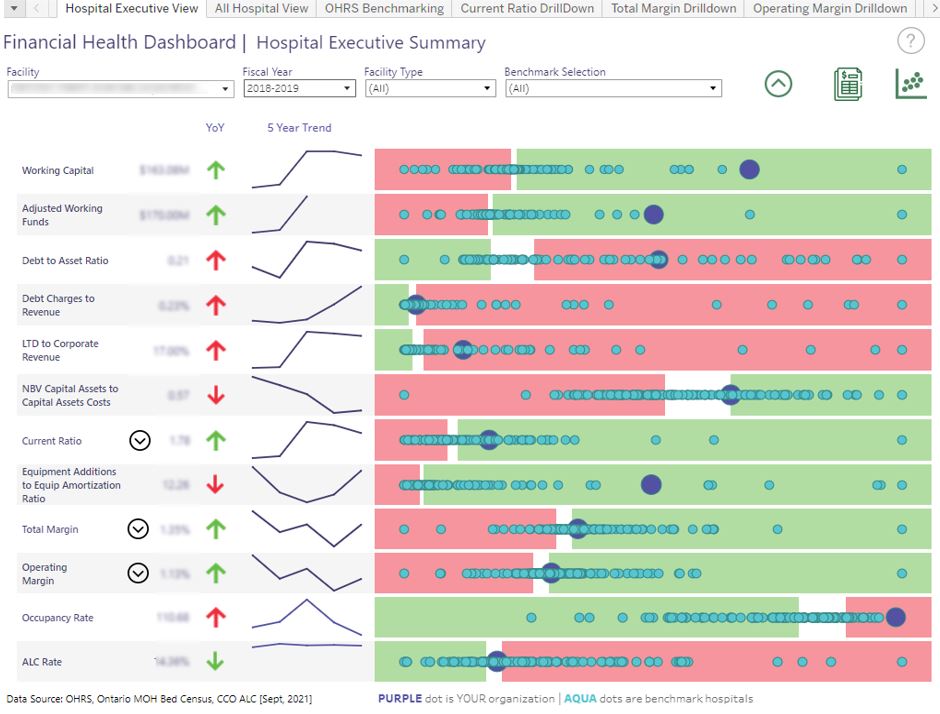
 The Financial Health Dashboard (FHD) provides you with a "shared source of truth" by sharing information about organizations' financial health using agreed-upon, industry-standard metrics that are available province-wide. The dashboard helps to improve data transparency and data quality by using information reported provincially by all hospitals in a consistent manner, which is then shared across authorized users.
To enable more tailored comparisons, you can benchmark within peer groups as well as use built-in customization to create sub-groups with specific organizations that are of greatest interest to you. This can help you identify opportunities for improvement and develop an understanding of your organization's performance over time against a select comparison group.
With a balance between operational (P&L) and balance sheet (B/S) indicators, the FHD provides a picture of the state of your organization's solvency, liquidity, and ongoing performance.
Drilling Down to Indicators
Drilldown features available through the FHD allow organizations to examine and present unique circumstances. By tracking financial metrics, the FHD provides clean, reliable data that offer a high-level picture of your organization's performance in important areas. Additionally, the tool allows you to access deeper levels of data for a closer investigation of your organization's performance. For example, if your organization's Operating Margin is trending unfavourably, benchmarking in the bottom 25th percentile, you can drill down into the components of revenue and expenses to identify where the largest change is and compare this against benchmark organizations.
Financial Health Indicator Correlations
Current Ratio vs. Operating Margin - A scatterplot that shows the interplay between how a hospital performs on Operating Margin correlated with Current Ratio. For organizations in the bottom-left quadrant, this indicates risk in terms of profitability and liquidity.
Current Ratio vs. Total Margin - A scatterplot that shows the interplay between how a hospital performs on Total Margin correlated with Current Ratio. For organizations in the bottom-left quadrant, this indicates risk in terms of profitability and liquidity.
Debt Ratio vs. Debt Charges – A scatterplot that shows the interplay between a hospital's Debt Ratio correlated with Debt Charges to revenue. For hospitals with a high debt ratio and high debt charges to revenue rate (top right quadrant), this could indicate possible solvency risks, whereas the more leveraged the hospital, this indicates a declining ability to meet financial obligations.
Equipment Additions to Amortization of Equipment Ratio vs. Net Book Value (NBV) as a percentage of book value – A scatterplot that shows the interplay between a hospital's NBV percent correlated with their amortization ratio. If a hospital's scope of services remains unchanged (or grows) and it is not replacing equipment appropriately, the impending future costs of capital asset repairs and replacement could restrict its flexibility, thereby putting pressure on other liquidity, solvency, and profitability measures. At-risk hospitals fall in the bottom-left quadrant.
Occupancy Rate vs. Alternate Level of Care (ALC) Rate - A scatterplot that shows the interplay between a hospital's Occupancy Rate correlated with ALC Rate performance. Those in the top-right quadrant are at or over capacity with a significant percentage of their beds occupied by ALC patients, which restricts patient flow and contributes to high wait times.
To learn more about the Financial Health Dashboard, email DataAnalytics@oha.com