The COVID KPI Review dashboard above, now available on the OHA's Data and Analytics Portal, offers hospitals easy access to regional and peer-level views of several key indicators.
Peer-level capacity and occupancy indicators now available
Responding to hospitals' appeals for improved access to information, the OHA has obtained access to some of the data submitted daily by hospitals to the Ministry of Health (MOH). The OHA's Data and Analytics platform now offers hospital members access to COVID-19 dashboards providing daily updates on hospital capacity and occupancy. The intent is to enable greater data transparency than is available elsewhere, with the ability to explore and summarize data at provincial, regional, and hospital site levels. The data will be refreshed daily and include:
- Daily changes in COVID and non-COVID admissions
- Tracking of ALC rates and throughput across peers
- Colour-driven flags for organizations facing capacity pressures in critical care and overall occupancy
This new tool offers members a granular look at hospital-level data and is complimentary to other more regional and community focused dashboards provided by the Ministry and Ontario Health.
As always, the OHA welcomes feedback from members about their user experience, any issues with data presentation, and how the tools can be improved to align with members' changing needs. This enhancement to the platform is part of the OHA's evolving work in data and analytics and effort to support members' information needs related to COVID-19. This dashboard signals the OHA's hope to continue this level of daily reporting on capacity, occupancy and other critical measures post-COVID.
Highlights from the COVID-19 Dashboard
The dashboards are designed to support hospitals that want a quick view of COVID-related impacts on occupancy and capacity at their organization and across peer hospitals. Using the application's simple filtering, users can select regions or individual hospitals to drive what is reported through the pre-built indicators. Colour is used to highlight when occupancy or capacity levels indicate hospitals are reaching "danger zones" or are seeing a high degree of pressure or change relative to peers.
Optimizing the view and user experience of the dashboard is possible by either selecting the "Full View" toggle at the bottom-right of the page, or adjusting the browser's zoom settings.
Upon introduction, there are three principal dashboards available:
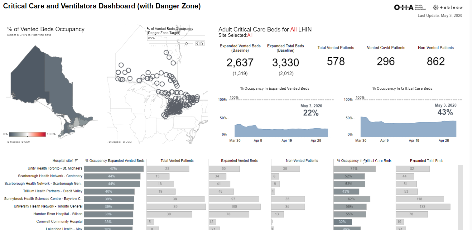
The Critical Care and Ventilators Tab
This is a topline view of occupancy and capacity in critical care beds, both vented and non-vented, including the extended capacity created in response to COVID (see image below). Indicators and trend graphs can be applied at the provincial, regional or individual hospital site level. LHINs that appear red on the regional map, or red x's on the hospitals map, reveal organizations that are reaching a capacity "danger zone." On the hospitals map, users can define their own "danger zone" threshold using the slider tool.
Below the topline indicators and filters, a table provides detailed, comparative hospital-by-hospital results across the key indicators. Filtering on the map focuses this list of hospitals to the selected region, while choosing an individual hospital in this table will update the indicators at the top of the page.
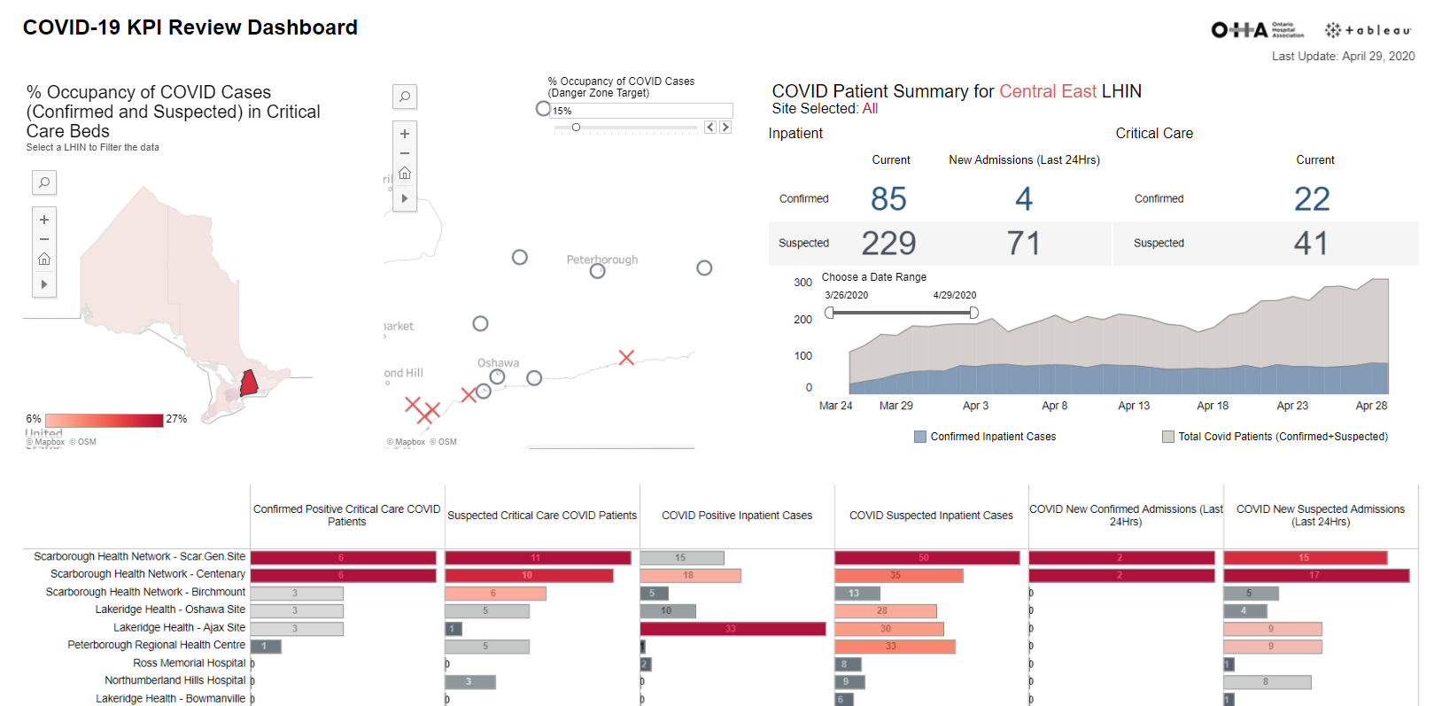
The COVID KPI Tab
This tab provides a topline view of indicators showing the pace and breadth of COVID-19 patient occupancy at hospitals (see image below). The principal indicators show the number of confirmed and suspected cases among patients, including admissions over the last 24 hours and those in critical care. Like the other tabs, regional and hospital maps enable filtering, reveal locations with higher levels of activity and allow the user to set preferred "danger zone" targets. The date range on the time-series area graph can be set to allow a narrower focus on a particular period.
The hospital table in the lower section of the tab provides comparative review of indicators across hospitals and can be sorted by column based on user preference.
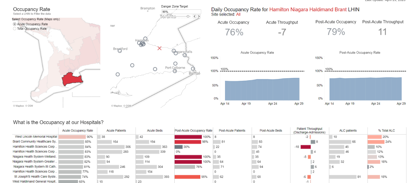
The Hospital Occupancy Tab
This tab is intended to put COVID-19 activity in the context of overall hospital capacity (see image below). Lower overall occupancy has characterized the early days of COVID-19 and will be important to monitor as elective surgeries and other health services resume more typical activity levels. Acute and non-acute occupancy, as well as throughput and ALC rates, can all be found on this page. Filtering options, customizable danger zones and hospital-level detail are all available, similar to the other tabs.
Access to the COVID-19 Dashboard
The dashboard is available through password-controlled access here (username and password required). Hospital staff wishing to reset passwords or request access can do so via OHA.com.
Questions
If you have any questions, please contact Anthony Jonker, Director of Data and Analytics, at ajonker@oha.com.
For questions regarding platform access, please contact DataAnalytics@oha.com.